Mobile Web3 UX Is Tough: 3 Problems We Solved So You Don’t Have To

Nadav Papay

·
Head of Design
Aug 20, 2025
·
3 min read
Mobile is becoming the front door to Web3, driven by gaming and wallet apps. For many, a tweet, Discord link or a push notification on mobile is their very first touchpoint with a Web3 project.
The problem? Mobile Web3 has some of the lowest success rates, often due to friction in wallet connections, app switching and cramming too much information into small screens.
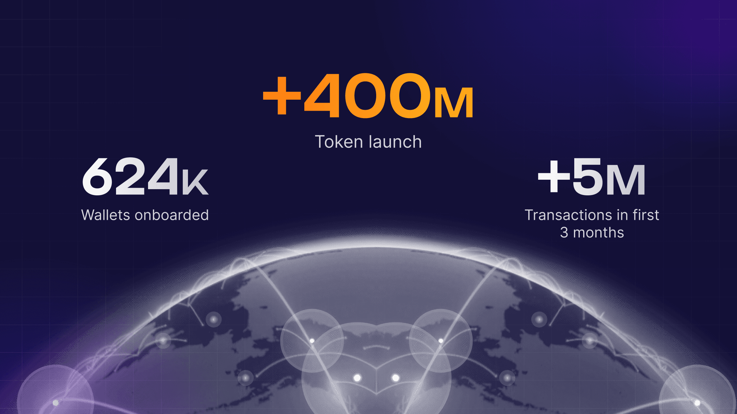
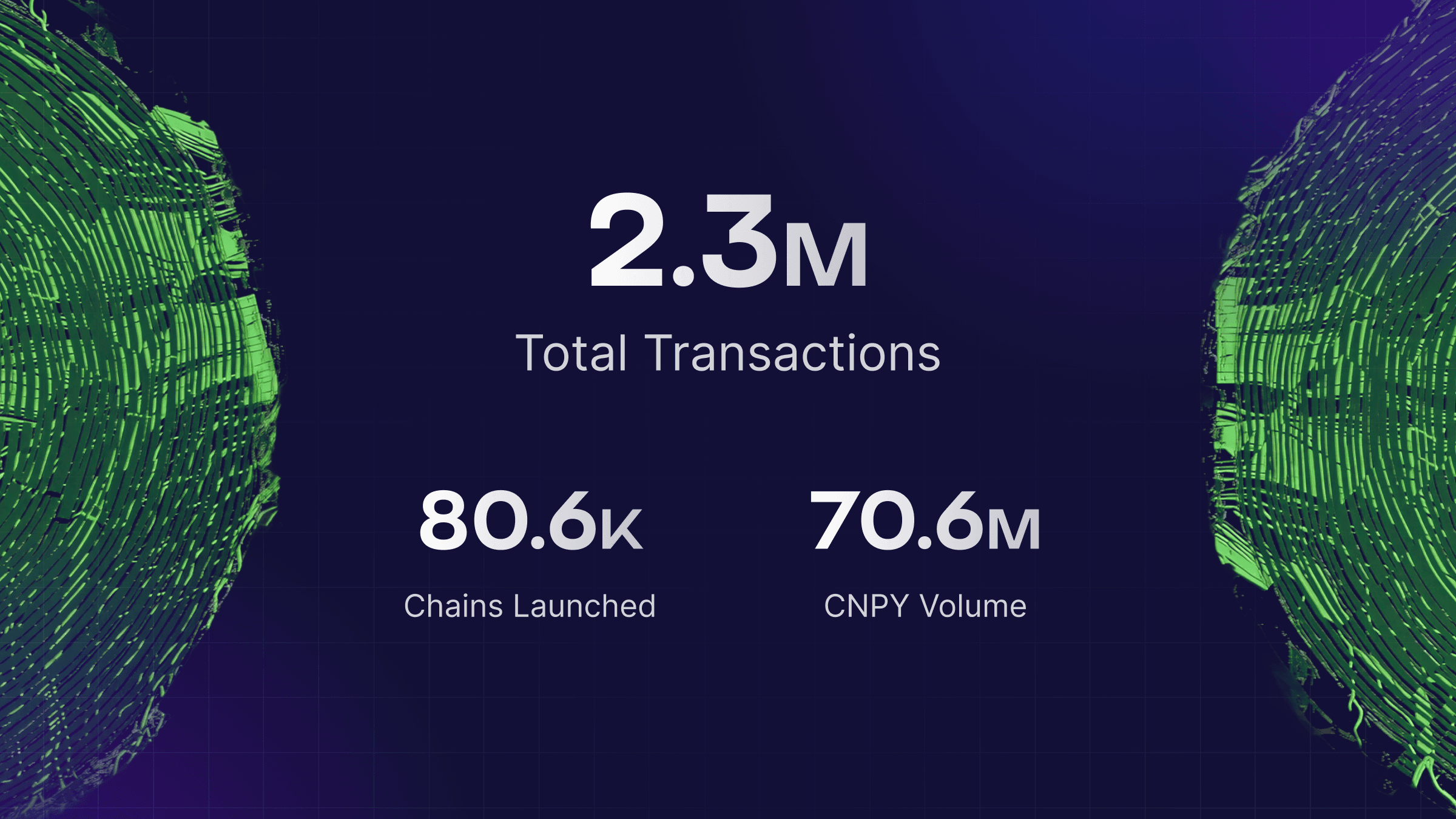
At Snag, we’ve worked with over 100 partners to improve their mobile experiences. We’ve tested different devices, wallets and user flows - so those first impressions lead to engagement, not frustration.
Here are three pain points we focused on, and what we’ve done to improve them.
Wallet Connection Flows Can Be a Nightmare on Mobile
The Pain:
Connecting a wallet on mobile often means switching between a browser and a wallet app. You’ve probably experienced the loop: open your default browser → switch to wallet app → sign → switch back… and it still doesn’t work. Then comes the reset-refresh-repeat cycle. Different browsers and wallets behave differently, which adds to the complexity.
What We’ve Done:
Wallet connections on mobile are now clear and predictable. Users always know where they stand - whether disconnected, connected but not signed in or fully signed in, thanks to simple state indicators. Visual prompts guide them through each step and one-click actions open the wallet app when needed and return them directly to where they left off, so the flow never feels broken or confusing.
Why It Matters:
Users move through wallet connections smoothly instead of dropping off at a critical step.

Social & Community Actions Are Multi-App Puzzles
The Pain:
Web3 engagement often spans multiple apps - X, Discord, Telegram, Steam and more. On mobile, switching between them increases the risk of drop-off, especially when users have to log in again, find the right post or channel, or navigate back manually.
What We’ve Done:
Multi-app actions are now smooth and straightforward. Instead of hunting through other apps, users are sent directly to the right location and can return seamlessly with a single tap. Even if something interrupts the process, they can quickly pick up where they left off without losing progress or needing to start over.
Why It Matters:
Cross-app actions no longer break the journey - users stay on track from start to finish.

Mobile Screens Demand Thoughtful UI Design
The Pain:
Web3 UIs are often packed with stats, graphs, dashboards and other data-heavy elements that look great on desktop - but on a small screen, they can become cramped, hard to read and overwhelming.
What We’ve Done:
Mobile screens now feel clean, intuitive and easy to use. Important actions are large and thumb-friendly, so they’re effortless to complete. Essential information is front and center, while secondary details stay tucked into expandable sections to avoid clutter. And because hover states don’t exist on mobile, key information is always visible without extra interaction.
Why It Matters:
Complex dashboards turn into clear, actionable mobile experiences users can actually enjoy.

Summary
Mobile is often the starting point for a user’s Web3 journey - but it comes with unique challenges. We’ve worked to make it smoother with better wallet handling, more reliable multi-app flows and interfaces designed for real mobile use.
At Snag, improvement never stops which means partners start from a strong foundation that only gets better - so they can focus on what matters most: growing their community.
Want to stay in the loop?
Subscribe to our mailing list to be the first to know about future blog articles.